Test a forecast againstcomparable programmes.
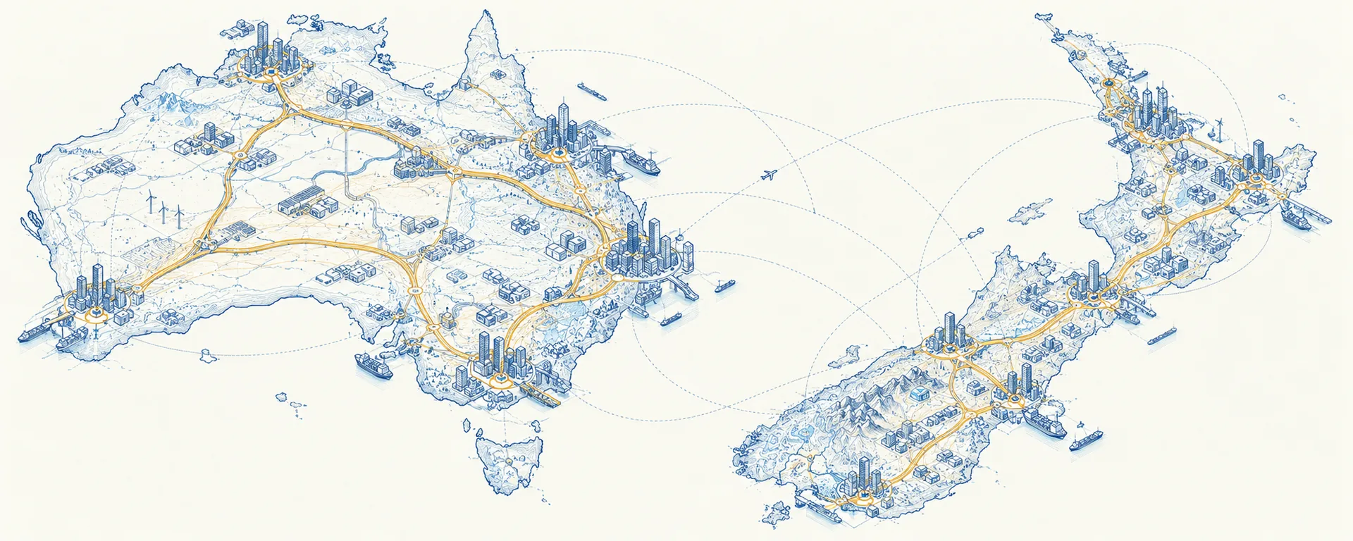
A forecast checked only against your own history carries your own optimism with it. We test it against comparable programmes across Australia and New Zealand, using only published data.
-
01
Gather the public recordBudget papers, annual reports and long-term plans, year after year. No client data.
-
02
Track how estimates driftHow each project’s published estimate actually moved, budget by budget.
-
03
Find comparable projectsComparable projects grouped by sector, scale, delivery model and stage.
-
04
See where your forecast sitsSee at a glance whether it allows for the movement comparable projects actually saw.
More detail
The question it answers
Available on a live project once two years of published estimates exist, which is usually when a forecast is under challenge.
Is this forecast realistic? We show how far comparable projects, at the same stage, have actually moved.
- 10
- years of the Victorian capital programme
- 4
- public data sets read so far
- 2
- years of published estimates needed
- 0
- confidential client data used
Public corpora read to September 2026. The Victorian figure is linked to its published source; the rest describe what has been read so far, and no client data is involved in any of it.
What a benchmark looks like
Illustrative figures.
Middle half of comparable projects, from +12% to +61% between business case and completion.
ReadingThis forecast allows for less movement than three in four comparable projects actually saw. That’s a question worth asking before it goes to the board.
Where the data comes from
The benchmark is built from the public record: budget papers, annual reports, long-term plans and business cases, read end to end rather than sampled. You do not have to send us anything for it to work.
If you want your own projects placed against that record, you can send them. Your data stays yours — it is never published, and never pooled into anyone else’s benchmark.
Examples of what we have read
- Ten years of the State of Victoria capital programme, read end to end from budget papers and forward estimates.
- A group of Australian councils, where publishing practice is uneven.
- Metlink, Greater Wellington: long-term plans, annual plans and regional transport planning documents.
- Metropolitan Wellington water services: the Water Services Delivery Plan, Commerce Commission material and council long-term plans.
We give you the benchmark, not the verdict. The decision stays with your team.
What you get
- For any forecast, how far comparable projects at the same stage have actually moved.
- Movement broken down by sector, scale, delivery model and stage.
- Every figure traceable to the published page it came from.
How it works
The core measure is estimate drift: how a published estimate moves across successive budgets, and how the completion date moves with it. We read budget papers, annual reports, long-term plans and business cases at scale, then group projects by sector, scale, delivery model and stage so a forecast is compared like with like. The result is a library of cost and schedule movement, each figure showing how many projects it rests on.
Next step
Got a forecast under challenge?
Tell us about it. After we’ve talked, we’ll build a reference class for your sector and jurisdiction.